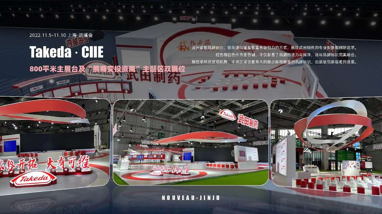
01Brand colours and ring structures
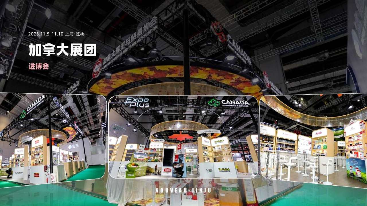
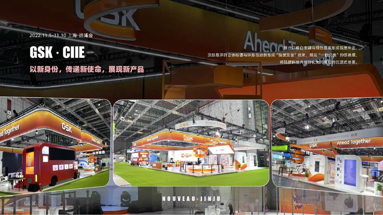
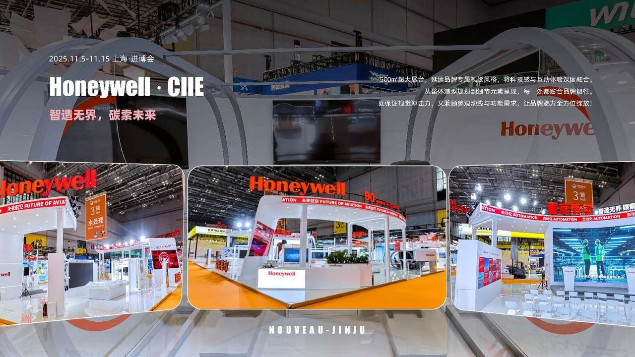
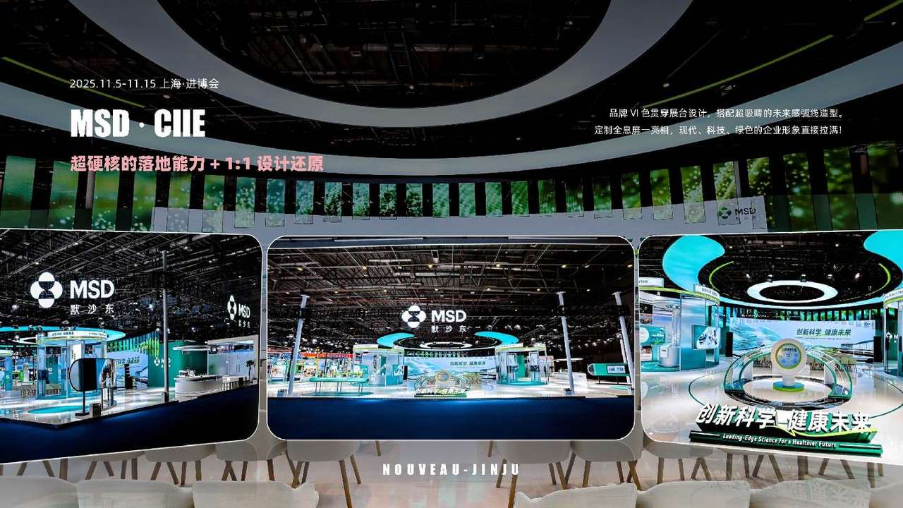
Red and white carry through the space and echo Takeda’s identity. Overhead rings establish a distinct outline; the central display area presents brand and product information.
02An open layout
Tall display structures and prominent signage draw attention within the open stand. The main stand and themed area organise their content separately, allowing visitors to approach from different entrances.